AI Image Generation for Social Media: What Actually Works in 2026
Every few months a new AI image model claims to have solved content creation. Most of them solve one thing: making a plausible-looking image from a text prompt.
Overview
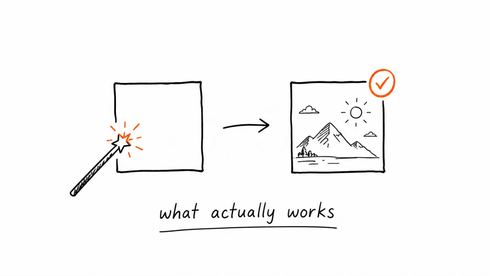
Here's what's actually working right now, what still needs a human pass, and how to tell the difference before you commit a workflow to it.
What AI Image Generation Actually Means Today
At its core, AI image generation takes a text description and produces a visual output. The models behind this have gotten dramatically better at photorealism, composition, and following detailed instructions. What they're still inconsistent at is brand accuracy: matching your exact colors, staying within your visual style, and avoiding the generic "AI-generated" look that readers now recognize on sight.
What Works Well Right Now
Product-style compositions. Clean product shots, flat-lay compositions, and simple hero images with clear subjects generate reliably well across most current models. If your content need is straightforward (a product on a plain background, an icon-style graphic, a simple scene), current tools handle it with minimal correction.
Consistent style when given a reference. Models that accept a reference image or a structured brand kit (colors, fonts, style keywords) produce dramatically more consistent output than prompt-only generation. This is the single biggest quality difference between a generic AI tool and one built with brand memory.
Iteration speed. Generating 10 variations of a concept in minutes, instead of briefing a designer and waiting a day, is a genuine and proven benefit. This is where AI generation adds real time value even when the first output isn't perfect.
What Still Needs a Human Pass
Exact brand color matching. Even good models drift slightly from precise hex values unless the tool explicitly locks them in. "Orange" and `#FF6B35` are not the same instruction to most models.
Text within images. AI-generated text in images (labels, headlines, UI mockups) is still unreliable across most models. Garbled letters and inconsistent fonts are the most common failure point. Add text in post-production rather than trusting the model to render it.
Anatomical and spatial consistency. Hands, complex layered scenes, and precise object counts (exactly 3 items, not 2 or 4) still fail often enough that they need a visual check before publishing.
Anything brand-specific beyond color. Logo placement, specific composition rules, and tone-of-voice-adjacent visual choices (premium vs playful, minimal vs busy) require either a well-configured brand kit or manual adjustment.
Common Mistakes Teams Make With AI Image Tools
Using a general-purpose model without brand configuration. Prompting from scratch every time produces inconsistent results even from the same tool, because there's no persistent brand memory between generations.
Publishing without a visual check. Even reliable models produce a bad output occasionally. Skipping a quick review step before scheduling is how AI-generated errors reach an actual audience.
Over-relying on text-only prompts. Text descriptions alone leave too much room for interpretation. Reference images and structured style guides consistently outperform prompt-only workflows.
Ignoring platform-specific formats. A great square image doesn't automatically work as a 9:16 vertical story. Generating separately per format, or using a tool that handles resizing intelligently, avoids stretched or cropped output.
Treating AI-generated content as "done" instead of "draft." The fastest path to generic-looking content is skipping the brand-alignment step. Treat the first generation as a draft, not a final asset.
Comparing the Approaches
| Approach | Speed | Brand consistency | Setup effort |
|---|---|---|---|
| General AI image tool, prompt only | Fast | Low, drifts each time | None |
| General AI tool + manual brand correction | Medium | Medium, depends on reviewer | Ongoing per image |
| AI tool with a configured brand kit | Fast | High, consistent by default | One-time setup |
| Traditional design/photography | Slow | High | Ongoing per project |
How to Set Up a Workflow That Actually Holds Up
- Define your brand kit first. Exact colors, fonts, and image style, not general descriptions. This step determines whether every future generation needs correction or not.
- Use a reference image where possible. Even a rough example of your desired style improves consistency more than adding more text to the prompt.
- Generate in batches, review before publishing. Create several variations, pick the best, and treat the rest as discarded drafts rather than trying to fix a weak one.
- Add text and fine details in post-production. Don't rely on the model to render headlines or precise labels correctly.
- Build a quick visual QA step into your process. A 30-second check before scheduling catches the errors that would otherwise reach your audience.
What Not to Automate
Don't publish AI-generated images of real identifiable people without consent, and don't use AI to fabricate testimonials, reviews, or before/after claims that didn't happen. These aren't just ethical lines, several platforms now have explicit policies against synthetic media used deceptively, and enforcement is increasing.
What the 30-Second Visual Check Should Actually Cover
A review step only helps if you know what you're looking for. "Does this look good" is not a check, because a generated image usually looks fine at a glance and fails on the specifics. Use a fixed order instead, so you're scanning for known failure points rather than forming a general impression.
- Text and glyphs first. Zoom to any lettering in the image and read it character by character. This is still the most common failure, and it's the one most likely to survive a casual look.
- Counts and hands. If the image contains people or a specific number of objects, count them. Wrong finger counts and an extra chair are the errors an audience notices immediately.
- Color against the actual values. Compare the dominant colors to your hex values, not to your memory of them. A shade that drifted slightly reads as off-brand across a feed even when a single post looks fine.
- Style consistency with your last few posts. Open your profile grid and check whether the new image sits alongside the previous three. Drift usually shows up between posts, not within one.
- Crop safety for each format. Check that the subject survives a square, vertical, and horizontal crop, and that nothing important sits where a platform overlays a caption or a profile icon.
Reject rather than repair. If two or more of these fail, generate again instead of fixing in an editor. Editing a weak generation usually costs more time than a new batch, and it teaches you nothing about which part of your setup produced the problem.
Log what fails repeatedly. A pattern in your rejections points to a gap in the brand kit, not bad luck with the model.
FAQ: AI Image Generation for Social Media
For product shots and clean compositions, often yes. For complex real-world scenes with specific people, settings, or lighting requirements, professional photography still generally outperforms AI generation.
Related Guides
Apr 26, 2026 · 10 min read
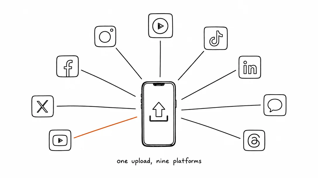
How to Post to 9 Platforms at Once
Stop logging in 9 times. Schedule everything, Instagram, TikTok, YouTube, LinkedIn, and more, from one place.
Apr 26, 2026 · 7 min read
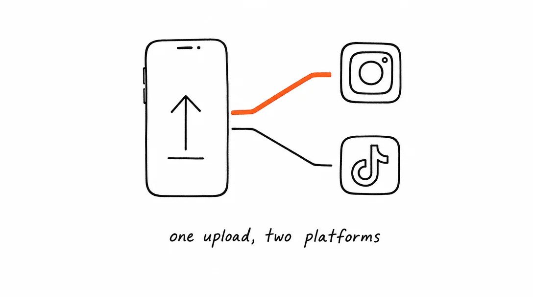
How to Post to Instagram and TikTok at Once
Upload once and publish to both Instagram and TikTok simultaneously. No double-uploading, no app switching.
May 19, 2026 · 8 min read
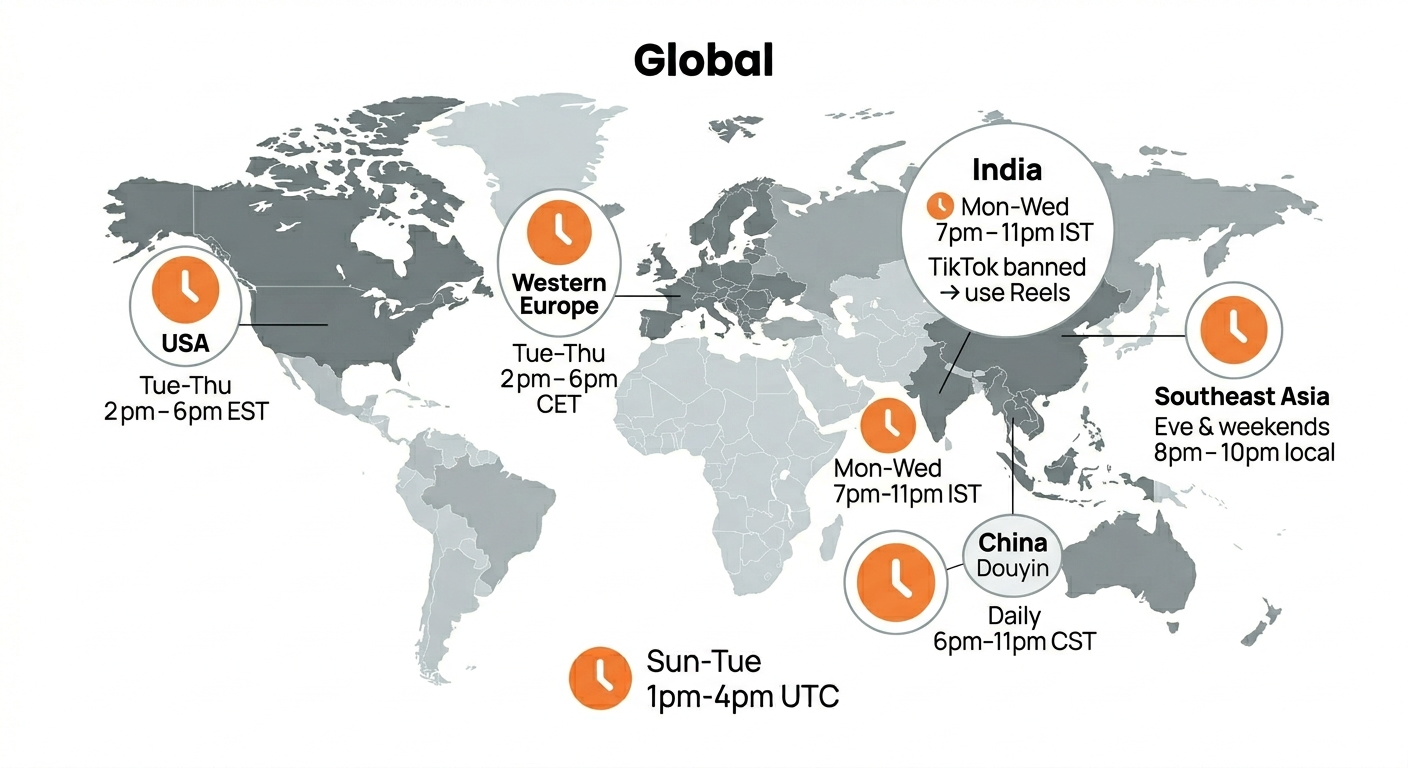
Best Time to Post on TikTok in 2026 (By Region)
Data from 2 billion TikTok engagements. Best posting times broken down by region, USA, Europe, Southeast Asia, and global audiences.
Your brand. One platform. Always on
Create, edit, and post from a single studio.
Start for freeSchedule every platform from one place, automatically.